ReadyTalk Conference Controls Redesign
You never get a second chance to make a good first impression. — Will Roger
Making a good first impression with a customer is incredibly important. At ReadyTalk, we walk every prospective customer through the interface of our Conference Controls to get an idea of how powerful it is.
It really does have awesome tools to make you more productive. However, with the prevalence of increasingly beautiful UIs (largely via Web 2.0+ and mobile), people expect a certain level of sophistication in the interface of applications they love to use. It was time to give the ReadyTalk Conference Controls a facelift.
Learn
We started by working with customers and the business to determine the most important section of the client. Customers identified the Sharing area as the most valuable real-estate.
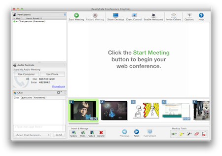
With this knowledge, we set out to make the Sharing area bigger. The most obvious two components to work were the Presentation area and the Bottom toolbar.
Presentation Area
First, the presentation area. It’s a very important piece of functionality, and one that defines ReadyTalk compared to competitors. We allow people to upload slides directly to our service, instead of requiring users to share their presentation application.
Because of this, we wanted to ensure that it was easy to interact with this piece of functionality. However, this area is not always important. Users should be able to dismiss it to get more real estate for the Sharing area.
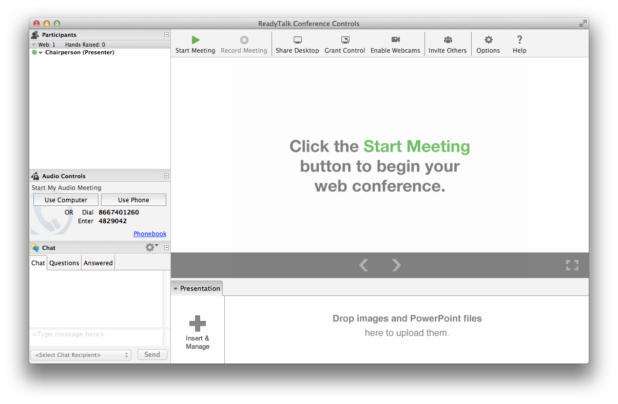
Therefore, we implemented the Presentation area as a collapsable tray. This way, the user can choose whether or not they want to see the content in the tray. We also have custom logic to automatically dismiss the presentation area on certain events (e.g. viewing another person’s screenshare) to make more space for viewing content.
Toolbar
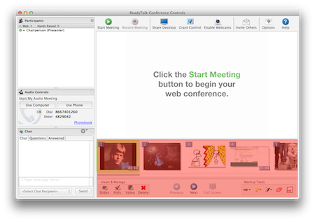
The bottom toolbar was another area where we were wasting a lot of space with static content. Also, we were breaking a rule frequently cited in UX studies called Fitts’s Law. The components that reacted to activating an affordance on the toolbar were actually in the share area. Clicking the ‘next’ button actually pushed a new slide to the Sharing area. Activating a whiteboard tool could only use used on the Share area to annotate a slide.
To help resolve this issue, we decided to move the slide controls to overlay the area that reacts to activating those affordances. Now, when the user wants to push the next slide or activate an annotation tool, they mouse into the Share area, activate the control and can immediately utilize their action.
Additionally, we moved the Insert & Manage tools into the newly-collapsable Presentation area. Since you’re managing items in your Presentation, it makes sense to have the mangement affordances to be close by. We also implemented a nice cover to hide the busy-ness of all of the Insert & Manage options.
One Step Further
We wanted to take this redesign one step further. We really needed to get rid of the old-school skeuomorphic, colorful icons and generally clean up the interface.
Icons
These old icons are from a previous generation. They look way too … Windows XP.

David Demmer came up with these excellent new icons.

He removed a ton of unnecessary color, and flattened them out a ton. I think they look way better.
Borders
Another thing that makes the previous client look dated is the excessive number of borders separating the different areas of the client. In some places, we had 3+ borders in the same area.
We really needed this fix this. To do so, we utilized borders only when absolutely necessary, leveraging natural separation more often than actually drawing a border.
Final Product
Taking all of the issues from above, we came up with this as a first step toward a more modern-looking ReadyTalk Conference Controls.
Get in Touch
Interested in working together? Let's connect.
Contact me